CARRIE BENGSTON
UX DESIGN | CONTENT
Hufflepuff Hardware mobile website

Hardware stores are a source of advice as well as products for home renovators, builders and DIYers.
The context
Hardware stores cater to a range of users from the home renovator, to the professional builder, to the home owner just wanting to replace a lightbulb. With more and more shopping done online, the pressure is on for retailers' e-commerce sites to make it easy for shoppers to get advice, research and buy products, and potentially experience the brand feel of a bricks-and-mortar store. Nielsen Norman Group regularly reviews trends in e-commerce UX.
"People who browse ecommerce websites need to get a clear understanding of the options available to them, with a minimum expense of time or effort."
- Nielsen Norman Group
The challenge
This project aimed to help the fictional company GAgrads Academy create a usable and magical mobile e-commerce website for their Harry Potter inspired hardware store, Hufflepuff Hardware. The goal of this two-week project was to develop a mobile-first ecommerce website to compete with other hardware store chains' online sites. A 'client brief' was supplied by the course instructor with research and personas, from which to design and test a prototype. Skills were to be developed in Axure, user testing, information architecture, user flows and visual design.
The process

I visited a local hardware store to speak to staff and observe shoppers. A huge variety of products was on display. Shelves and aisles were labelled.
Visiting a real store
To better understand the real-world hardware store environment, I visited a Mitre10 store in York St, in the Sydney CBD - a contextual inquiry. I observed shoppers and talked to store staff (subject matter experts). Findings included:
-
there was a huge variety of products on display, with well-labelled shelves and aisles ('masking tape', 'fillers', 'timber') to orient shoppers
-
staff (about 5) were readily identified by their uniforms and were behind the counter and in other parts of the store
-
staff were informative and friendly, ready to share their expertise and advice.
Assessing competitor and comparators' websites
I analysed the structure and layout of hardware store websites, notably Mitre10 and Bunnings, considering both desktop and mobile versions. I found:
-
home pages were cluttered with products and promos
-
products were grouped into logical categories (such as 'gardening', 'painting') but could be many layers deep, eg 5 clicks from top category page to product page in some cases.
-
utilities such as log-ins and local store opening hours were easily found in the design header
-
pages had long scrolls on mobile which could be disorienting
-
product pages had key information and clear images.
“I go to the hardware store about twice a week. I often check stuff online before I go.”
- Ross, home handyman

Some products, like this power drill set, were relatively easy to categorise but card-sorting helped test and extend the draft information architecture.
Grouping products
I wanted to ensure easy product browsing by creating an information architecture that reflected users' mental models of hardware products. The course instructor provided a list of sample hardware products to sort.
We were fairly confident with some categories, guided by other hardware stores' sites and real stores. But we found other products, such as gap filler and decking oil, were harder to classify. With 2 fellow students, I used Optimal Sort to run an online card-sort survey to refine our categorisation. We gave users a list of 34 sample products to place into our given categories and, for any difficult-to-sort products, we invited users to create and name additional categories. The 24 responses (58% response rate) helped me devise a taxonomy. Changes emerging from research included adding a 'painting and decorating' category and expanding the 'cleaning' category to 'cleaning and storage'.


Product categories created for the Hufflepuff Hardware site shown on drop down menu (left) and 'browse by category' page (right). Categories were identified and tested using an online card-sorting survey.
User flows
How do shoppers browse and buy online? User flows created in Axure stepped through the processes for:
-
choosing products and
-
purchasing them.
The two flows (choosing, purchasing) visually outline steps like:
-
signing in to or setting up a store account
-
seeking expert advice on products or projects
-
adding to and viewing a shopping cart
-
entering payment details and arranging delivery.
The flows represent the actions and decisions of typical users including the 3 personas given.

User flow for choosing a product, including steps for seeking advice where needed. This flow leads on to a second, the checkout user flow.

One of the 3 personas given for this project, Harry, has a wedding planner business. Getting essential hardware items, sometimes urgently, is part of serving his customers.
The solution
The client brief specified key deliverables for GAgrads Academy's hardware store's e-commerce website, including:
-
clear ways of locating specific products
-
ways to steer customers to on-sale products
-
product pages that follow a template
-
allow purchasing of multiple products
-
show brand values and personality, point of difference
-
opportunity for customers to request products not stocked by store
A Minimum Viable Product (MVP) for the mobile-first website required some key screens to support the browsing and purchasing of products by customers. Research showed the need for:
-
uncluttered home page reflecting clear brand/logo
-
a compact design that conveys detailed product information efficiently on a small screen
-
simple and functional checkout page
-
a logical site structure and search facility that makes products discoverable in multiple ways
-
a chat icon for users seeking advice and requesting products.
I created a medium fidelity clickable prototype in Axure, based on my rough sketches of what the product could look like. I then employed the learn-build-measure iterative approach to test prototypes with users. Usability testing involved tasks that approximated those of the given personas. I asked friends and fellow students to test, some of whom were similar to the personas. Their feedback was invaluable and occasionally surprising, such as finding out when 'help' is not wanted.

User testing with friends, family and fellow students allowed me to see where my clickable prototype worked well and where it needed improvement. The iterations below were informed by testing on 6 users.

Home page iterations showing changes made based on user testing. The design reflects the brand colours and magical personality. A higher-fidelity design helped users assess the experience.
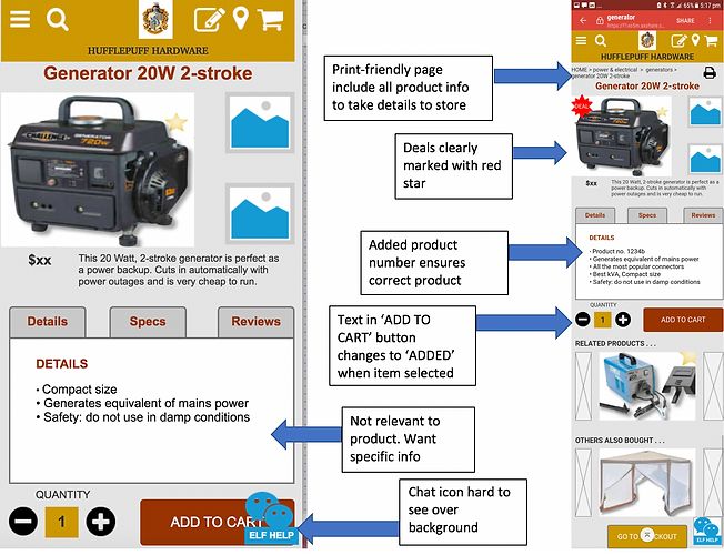
Product page iterations showing changes made based on user testing. I created and applied a template for individual product pages. I saw tabs as a way of giving users access to different types of product information on compact mobile screens without having to scroll.
“I sort products from highest price to lowest because I like quality”
- Tony, occasional hardware store shopper
For online retailers a seamless and satisfying e-commerce user experience can be a huge competitive advantage in a crowded online marketplace.
The prototype I developed was successful in allowing users to achieve their browsing and purchasing goals. Future design iterations could improve the design by making the chat icon more visible, exploring a tile design for the top categories, adding images of products in use and a zoom function or lightboxes for product images. I would also re-test the information architecture on the full product suite and adjust if needed. The finding from several users that they would hire not buy large pieces of equipment like generators suggests a hire option or section could be added to the site if the business was willing.